CareerFoundry UX/UI immersive project
2022
Olive-Ilive
A responsive health and wellbeing portal designed for inclusivity, privacy and the questions people are embarrassed to ask.
- Role
- UX Designer, UX Researcher, Data Analyst, Visual Designer
- Timeline
- End-to-end
- Disciplines
- UX Research, Product Design, Design Systems
- Tools
- Figma, InVision, Miro, Google Forms, UsabilityHub, OptimalSort, Pen & paper
At a glance
- The problem
- People trying to improve their physical and mental health struggle to reach reliable information and the right specialist, because the resources are scattered and the questions are often ones they would rather not ask out loud.
- My role
- Sole designer across research, analysis, IA, interaction, visual design and the design language system.
- What I did
- Lean UX (build, measure, learn) with competitive analysis, a 52-person survey, 5 interviews, open card sorting, moderated usability testing against Nielsen's severity scale, and an A/B preference test.
- What changed
- A tested, responsive design and a documented design language system. The A/B test result was statistically significant; the broader design was iterated but the project is a course project, not a shipped product.
How to read this case study
Research writing gets less useful the more it blurs what was found with what was guessed. Every claim below is labelled with how much weight it can carry.
- Observed
- Came directly from data I collected. A source is always named.
- Interpreted
- My reading of that data. Reasonable, and still mine rather than the participants'.
- Hypothesis
- A proposition I have not yet tested. Written down so it can be proved wrong.
- Unvalidated concept
- A design idea. There is no evidence yet that it works.
Constraints as the brief
Four constraints were set before any design began. They did more work than any feature list.
Olive-Ilive is a responsive portal for health information, medical records and appointments, designed to be usable on a phone, a tablet or a desktop. As a designer it helps enormously to have criteria and constraints to work against: constraints are what make the creative decisions decidable.
The four constraints
- Design for a specific circumstance: people with high-stress jobs and no time for a 'work-life balance' they have been told to find.
- Design for inclusivity: users arrive with different physical, psychological and social circumstances, and an inclusive design reaches more of the people who would benefit.
- Educate the user: not everyone knows how to change a behaviour or build a habit; the portal has to support the journey rather than just record it.
- Remember privacy: health and medical information is sensitive, and users must feel reassured before they will use any of it honestly.
Discover
I began with competitive analysis of two adjacent products: Sanvello, centred on mental health through short activities and a supportive community, and Flo, a women's health app tracking the reproductive cycle. Both are strong in a narrow band, which framed the question of whether a broader portal is a genuine need or a diluted one.
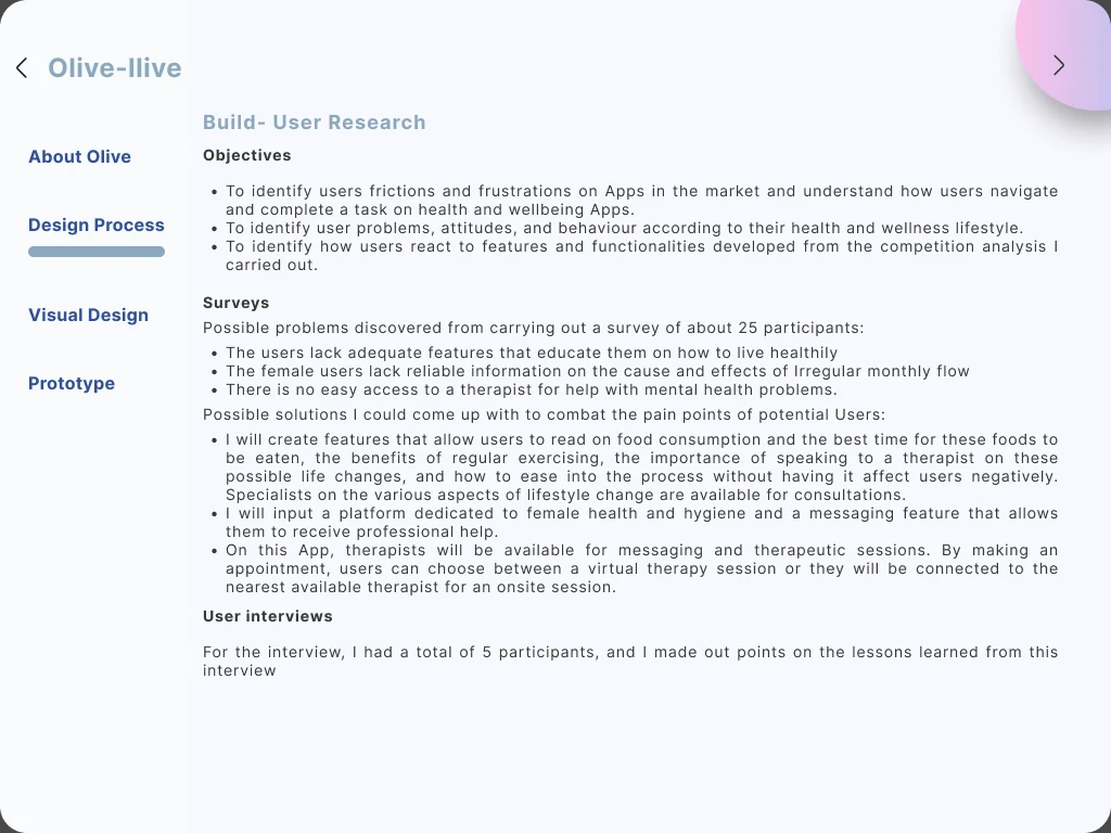
I then ran a survey and follow-up interviews, with three objectives: find where existing apps create friction, understand how people navigate and complete tasks in them, and see how users respond to features derived from the competitive analysis.
- Survey participants
- 52Survey participants
- Survey questions
- 19Survey questions
- Interviews
- 5Interviews
SourceGoogle Forms survey and semi-structured interviews.
Problems identified
Observed
Users lack features that guide them in maintaining a healthy lifestyle, as opposed to features that merely record what they already do.
SourceSurvey of 52 participants
Observed
Female participants struggle to find reliable information on the causes and effects of irregular menstrual cycles.
SourceSurvey of 52 participants
Observed
Access to mental health therapists is not readily available to participants when they want it.
SourceSurvey of 52 participants
Observed
Male participants generally did not consider their hormonal cycle and were unaware of the effects of hormonal imbalance.
Source5 semi-structured interviews
Observed
Participants preferred to address health concerns from home, and welcomed apps that could resolve as many issues as possible without a trip.
Source5 semi-structured interviews
Observed
Participants welcomed transferable health records stored in an app, and every one of them raised data security as a concern in the same breath.
Source5 semi-structured interviews
Interpreted
The recurring shape across these findings is that people want to ask an uncomfortable question without an audience. That reframes the portal's core value from convenience to privacy of enquiry, and it is why the search-and-answer path became the primary flow rather than a secondary one.
Define
Hypothesis
Developing a platform that offers 24-hour healthcare guidance and connections to healthcare experts is essential; this will be confirmed or refuted by user feedback and reviews.
From the research I built personas, a journey map, task flows and user flows. One user story carried most of the design weight: as someone with an irregular menstrual cycle, I want to find reliable information about the cycle so that I can understand how to manage my situation. Entry point: open the app. Success: the answer is reliable and relevant to what was actually asked.
Define: the information architecture
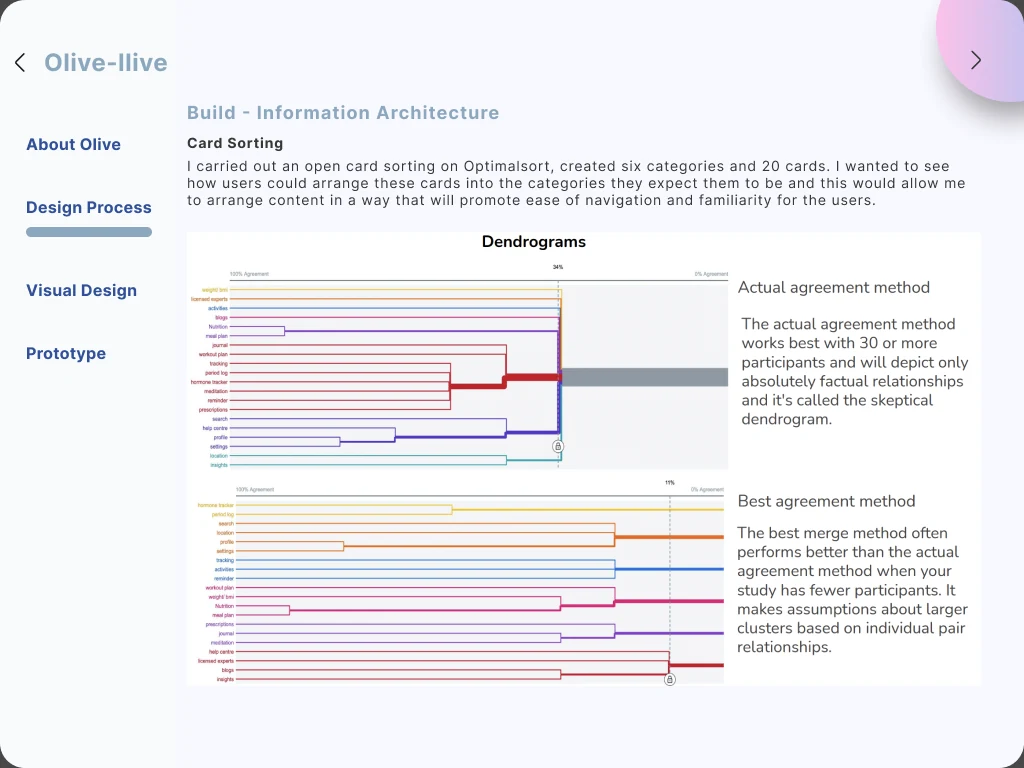
I ran an open card sort in OptimalSort with 20 cards across six categories, to see how users would organise the content rather than how I would. Reading the dendrogram, nutrition and meal-plan cards clustered most tightly, followed by profile and settings.
Observed
Participants clustered nutrition and meal-plan content most closely of any pair, and profile and settings second.
SourceOpen card sort, OptimalSort, 20 cards / 6 categories
Interpreted
The clusters did not match my original sitemap, so I revised the sitemap rather than the participants' mental model. This is the cheapest correction in the whole process and the one most often skipped.
Develop
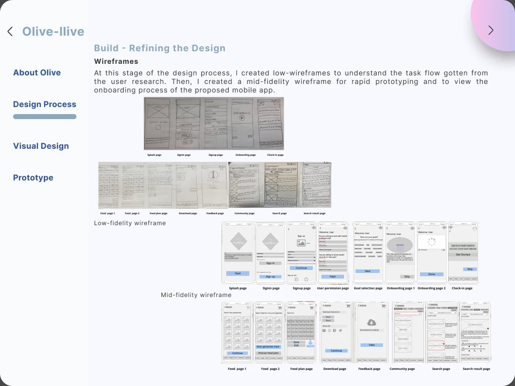
I moved from low-fidelity wireframes through mid fidelity for rapid prototyping of the onboarding flow, then to a high-fidelity clickable prototype. I planned and moderated the usability test (choosing the method, writing the test plan and a script to keep sessions consistent), then analysed the results with affinity mapping and a rainbow spreadsheet, rating issues against Nielsen's severity scale.
Separately, I ran an A/B preference test on UsabilityHub between two splash screen designs.
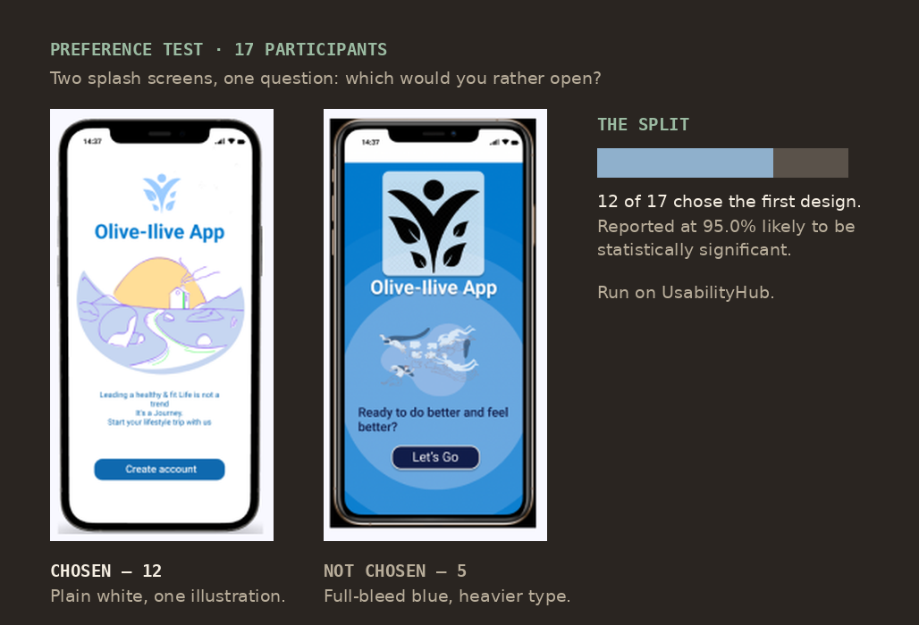
The chosen design is plain white with one illustration, a short line of copy and a single Create account button. The one that lost is full-bleed blue, with a boxed logo, heavier type and a Let's Go button. Twelve of seventeen participants chose the first, reported at 95.0% likelihood the difference was not chance.
- Preference test participants
- 17Preference test participants
- Split, design A over B
- 12 / 5Split, design A over B
- Reported significance
- 95%Reported significance
SourceUsabilityHub preference test.
Observed
The simpler of the two splash screens was preferred by 12 of 17 participants, at a reported 95% likelihood that the difference was not due to chance.
SourceUsabilityHub preference test, n=17
Interpreted
For a first screen in a health context, simpler wins. My reading is that a splash screen is the moment a user decides how much of themselves to hand over, and ornament reads as a product with something to sell.
Deliver
Once usability issues were resolved I designed the final screens in Figma, working from Gestalt principles and Material Design guidance, aiming for a clean and minimal surface that helps people reach a goal rather than admire the interface. Colour, iconography and illustration were checked for accessibility as part of the design rather than as a pass at the end.
After several iterations the result was documented as a design language system, so the decisions were reusable rather than re-argued.
What I took from it
- Research is not optional. Nothing user-centred came out of this project that did not go in through an interview or a survey first.
- The product exists to solve the user's problem, not to express the designer's preferences, a lesson that is easy to agree with and hard to apply when you like your own idea.
- Design guidelines are what hold a design together. Having them written down made intuitiveness, learnability, efficiency and consistency into things I could check rather than things I could claim.
Scope, ethics and limits
What this is
- A responsive portal concept for health and wellbeing information, records and appointments.
- Designed against explicit constraints for inclusivity and data sensitivity.
What this is not
- Not a clinical product, and not a substitute for medical advice.
- Not a diagnostic tool. The design connects people to practitioners; it does not assess them.
What is still unvalidated
- Real-world outcomes. Usability testing measured whether people could complete tasks, not whether the product improved anyone's health.
- Whether the privacy assurances in the interface would be sufficient to earn trust at scale.