Full-time, in-house role
2023 to 2025
IoT Venture GmbH
Two years as the only designer on a connected-bike product, where most of the design work was deciding what the system should say when it isn't sure.
- Role
- Sole UI/UX Designer
- Timeline
- Oct 2023 to Aug 2025 · Darmstadt, Germany
- Disciplines
- UX Research, Product Design, Interaction Design, Design Systems
- Tools
- Figma, Adobe Creative Cloud, Jira, Confluence, ChatGPT Enterprise
At a glance
- The problem
- A connected-bike product across a consumer app, a partner dashboard and several white-label apps, where the hardest screens report a state the rider never asked about.
- My role
- Sole designer. Owned all UX and UI: research, the 3.0 redesign, usability testing, and the design system holding the surfaces together.
- What I did
- Double diamond. Research and a 15-participant beta test before the build was fixed, then the inspection state model, the responsive dealer portal, the permission sequences and the stale-data indicator, delivered on one design system.
- What changed
- 3.0 shipped October to November 2024 across the flagship and white-label apps on one design system. Retention rose 20% after release, a figure of my own rather than an independent audit.
How to read this case study
Research writing gets less useful the more it blurs what was found with what was guessed. Every claim below is labelled with how much weight it can carry.
- Observed
- Came directly from data I collected. A source is always named.
- Interpreted
- My reading of that data. Reasonable, and still mine rather than the participants'.
- Hypothesis
- A proposition I have not yet tested. Written down so it can be proved wrong.
- Unvalidated concept
- A design idea. There is no evidence yet that it works.
What shipped
Mobility 3.0, October to November 2024, across the flagship app and the white-label apps built on the same platform.
I was the only designer at IoT Venture for two years, and 3.0 was the centre of it: a redesign of It's My Bike that had to land on the flagship app and on every partner-branded app built from the same platform.
User retention rose 20% after the release. That figure is my own, taken from what we tracked at the time rather than from an independent audit, and it is the only number of its kind on this page.
After 3.0 the work continued as evolution rather than a second redesign. Version 3.3 was on the roadmap, scheduled for October 2026, when I left. I designed toward it and did not ship it.
Three decisions that got it there
Interpreted
Test before the build is fixed, not after. The 3.0 research ran through an iOS beta while findings could still change what was being built, which is the difference between research and a report.
Interpreted
Treat conditional behaviour as the product. Inspection states, permission outcomes and stale device data are all moments where the system knows less than the interface implies, and they are where a connected product earns trust or loses it.
Interpreted
Build one system, not several skins. With one designer and a flagship app plus white-label partner apps, a shared system was the only thing that made the surface area tractable.
Discover
Fifteen riders, in a beta, ten months before release.
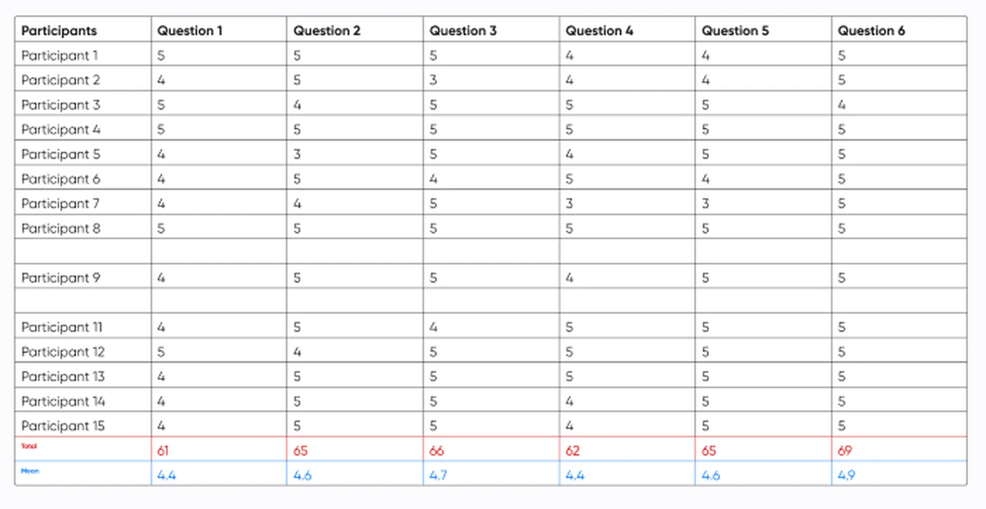
Fifteen people took part; fourteen returned a complete set of scores, plus open feedback. The scores were high, which is the least interesting thing about them. The twenty-seven written comments were the useful part.
- Participants
- 15Participants
- Complete responses
- 14Complete responses
- Rated questions
- 6Rated questions
- Written recommendations
- 27Written recommendations
SourceUsability test results board, December 2023, 15 participants, 5-point scale plus open feedback
Observed
Across the six rated questions, mean ratings ran from 4.4 to 4.9 out of 5 over the fourteen complete responses, with the two lowest both at 4.4.
SourceUsability test results board, December 2023, 15 participants, 14 complete responses, 5-point scale
Observed
Three changes followed directly: the report-theft call to action was simplified, all linked trackers were surfaced on the home screen map, and tracker status was promoted above trip history.
SourceUsability test recommendations, December 2023, marked Done in the design file
Interpreted
Almost none of the accepted changes were about making something clearer. They were about ordering and reach: what sits above what, and how few steps away a thing is.
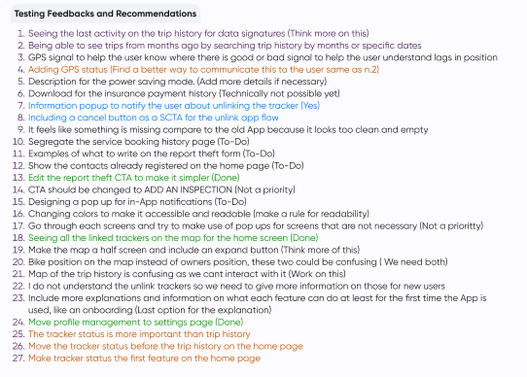
The twenty-seven items are tagged done, to-do, not a priority, or not yet possible. Those tags are a snapshot of December 2023, not verdicts: by the time 3.0 shipped, every item on the list had been designed for.
Define
The hard screens were never the ones a rider asks for.
A maintenance window opening. A tracker that has stopped reporting. A permission declined six months ago that a feature now needs. None is a screen anyone navigates to, and all are where the product either explains itself or becomes something you tolerate.
Interpreted
Permissions, stale data and unexplained technical values are one design problem wearing three costumes. Each is a moment where the system knows less than the interface implies, and the honest move is to show the gap rather than smooth it over.
Develop
Three places that argument had to survive contact with a screen.
The bike predicts when it needs inspecting, which turns a continuous estimate into something the interface has to say out loud. The model settled on three states, and each asks the rider for something categorically different, so the component changes shape rather than only colour.
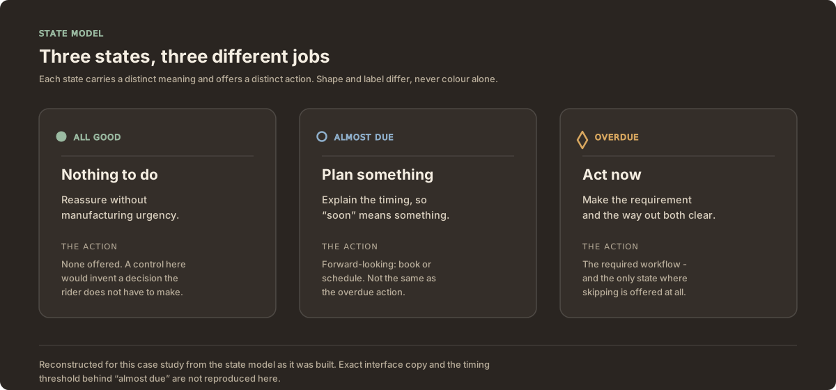
All good offers no control at all. Almost due offers scheduling, with the timing explained. Overdue states both the requirement and the way out. Each is distinguished by label and marker shape as well as colour.
Interpreted
These are not three severities of one message. "Nothing to do", "plan something" and "act now" are different speech acts, and rendering them as one component with a changing colour flattens that distinction back out.
The same reasoning runs through the dealer portal, where bike shops order hardware, assign it and get back to work. One responsive system across phone, tablet and desktop: checking a delivery on an iPad behind the counter is the same task as doing it on a laptop out back. Own design file, sample data.
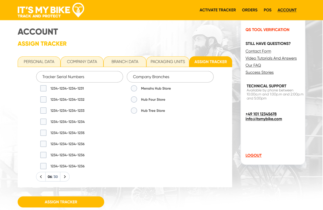
Two columns: which trackers, and which branch. The counter beneath reads 06 of 30, so a shop working through a batch can see how far in they are without counting checkboxes.
Interpreted
Pairing a paginated serial list against a branch list, with a running count, treats assignment as a batch task someone is partway through rather than a form they fill in once.
And on the home screen, where two alert conditions can each be on or off independently, the status card composes a sentence from whichever are live rather than storing a label per combination.
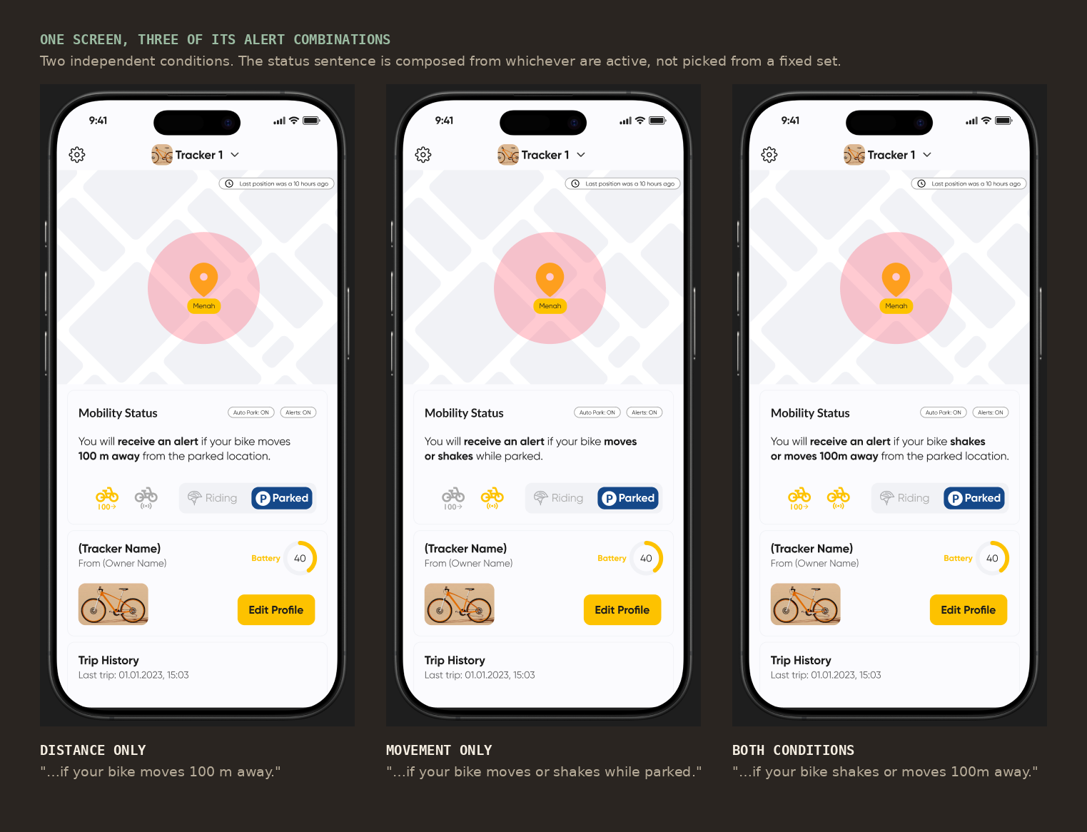
With distance alone, the card says an alert will come if the bike moves 100 m away. With movement alone, if it moves or shakes while parked. With both, either. The inactive condition's icon greys out, so the sentence and the icon row always agree.
Interpreted
Composing the sentence from the live conditions is what keeps it honest as conditions are added. A fixed set of labels goes stale the moment a third condition exists.
Deliver
One system, several brands, one designer.
3.0 went out across the flagship and the white-label apps together. The design system is what made that possible: partner brands were configured rather than redrawn, so a change to a shared pattern did not become a week of reconciling four apps by hand.
Step 01
Permissions, across two platforms
iOS and Android ask differently, and a rider gets one good chance at each prompt. The sequences explain what the permission buys before the system asks, and treat a decline as a state the product continues from. Designing the declined path is most of the work.
Step 02
Stale tracker data
A last-movement time is the most dangerous number in a tracking product, because an old reading looks exactly like a current one. The indicator makes freshness visible, so "the bike has not moved" and "we have not heard from the bike" stop looking alike.
Step 03
The fleet portal
Fleet operators look at many assets rather than one bike, which inverts the question from "what is this bike doing" to "which of these needs me". Same states, different unit of attention.
What this does not prove
The lesson is narrower than "design for the user": connected products are mostly conditional behaviour. The ideal state is the screen you design once and rarely look at again. Everything that makes a product feel trustworthy or shabby lives in the other states, and those get specified last.
Scope, ethics and limits
What this is
- Interface and interaction design for a connected-hardware product, across mobile and fleet-facing surfaces.
- Grounded in a 15-participant usability test I ran myself, named where the claims rest on it.
What this is not
- Not a disclosure of the vendor integrations, their technical field definitions, exact interface copy or timing thresholds. Those remain confidential.
- Not a claim that every workstream belonged to one release. These ran across two years and are gathered under one theme for the telling.
- Not a measured impact report. One retention figure exists and it is self-reported.
What is still unvalidated
- Why three inspection states is the right number. The states were built; the argument was never tested against users.
- Whether the conditional skip rule reads as an escape hatch rather than a dismissal.
- Whether the pre-permission explanation improves the grant rate. No measurement was taken.
- The stale-data threshold. The design makes freshness visible; nobody checked whether the window matches what riders treat as current.
Who is not represented
- Dealers and workshop staff were not part of the usability testing, which ran with riders through the iOS beta. The workflow designed for them rests on requirements and review, not observation.